Timeline: 2015 – 2017
Clients: Codigree & KeepItSoft
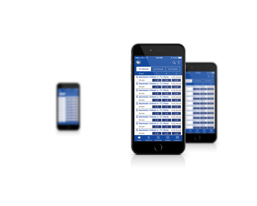
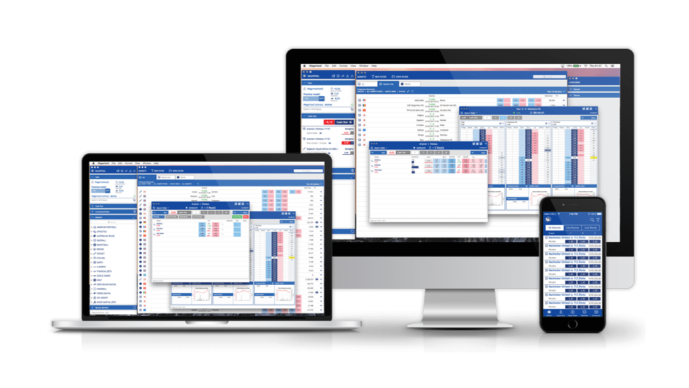
Platform: Desktop (Cross-platform)
Primary User: Mid-to-high level sports traders
Certification: Betfair Certified
Wagertool (Betfair certified) trading platform designed to provide a fast, efficient, and customisable betting experience for users.
Wagertool needed to serve professional traders working under extreme time pressure, with complex real-time data and zero tolerance for interface friction. Built with a content-centric approach, it focuses on delivering a clean interface that enhances trading speed and efficiency.
Context & Scope
Sports trading on exchanges like Betfair occupies a space between financial trading and live sports analysis. Professional traders (those managing significant positions across multiple markets simultaneously) operate under conditions of genuine time pressure. Interface friction isn't an inconvenience. It's a direct financial cost.
Betfair's native platform was designed for the casual bettor. Professional traders used it despite its limitations, not because of them. The absence of a ladder view, the poor cash-out UX, and the inability to configure the trading environment meant every session began with unnecessary friction.
Third-party tools existed but split into two unsatisfying categories: technically capable but visually overwhelming (designed for algorithmic traders), or simplified to the point of inadequacy. There was no well-designed professional tool in the middle.
Wagertool was built to be that tool. I joined as Lead Designer, responsible for the full design output: user research, UX architecture, information design, UI system, brand identity, and interaction design for the ladder view, cash-out flow, and workspace customisation.
Product Positioning
Professional traders pay for a certified third-party tool when the native platform's cost, in missed opportunities, cognitive friction, and adaptation overhead, exceeds the subscription cost of the alternative. That threshold is lower than it looks: a single missed cash-out in a significant position can cost more than a month's subscription. The value proposition wasn't "better UX." It was "fewer losses attributable to tool friction."
This framing shaped every feature prioritisation decision. The cash-out flow wasn't upgraded because it was aesthetically poor. It was upgraded because slow cash-out was measurably costing users money. The ladder view wasn't added because it was a standard financial trading feature. It was added because its absence was the single most-cited reason for traders staying on Betfair native despite its other limitations. Every feature decision was evaluated against the same question: does this reduce the cost of tool friction, or does it add to it?
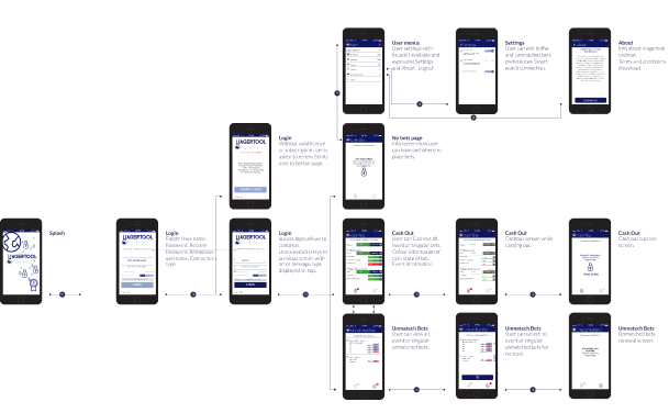
My Role & Leadership
- Led the full design programme from discovery to delivery: research, UX, visual design, interaction design, brand identity
- Conducted field studies and structured interviews with traders from semi-professional to full-time high-volume operators
- Established the design principles that governed every decision: trading speed above all; content over chrome; user control at every interaction point; zero visual noise in the primary trading view
- Designed the ladder view interaction model, working closely with engineering to define data refresh rates, visual update behaviour, and interaction affordances that would perform reliably under live market conditions
- Led usability testing under simulated trading conditions, including protocol design for measuring perceived performance below 100ms thresholds
- Maintained design governance across two client organisations (Codigree and KeepItSoft) with a written, shared design principle document and a defined decision escalation path
Problem Statement
No ladder view in Betfair native. The ladder view is the standard interface in financial trading and the preferred view among experienced sports traders. Its absence was the single most-cited friction point.
Cash-out UX failed under pressure. The native flow required multiple interactions and provided insufficient confirmation feedback, creating hesitation at exactly the moment speed was most critical.
Interface density was miscalibrated. Most competitor tools showed too much (every market, every position, every historical data point) requiring significant training to navigate.
No workspace customisation. Professional traders have highly individual workflows. The inability to configure column layouts, market groupings, and alert thresholds to match personal trading styles was a daily frustration.
"The interface should disappear. I'm not trading the software, I'm trading the market. Every click the tool forces on me is a mistake waiting to happen."
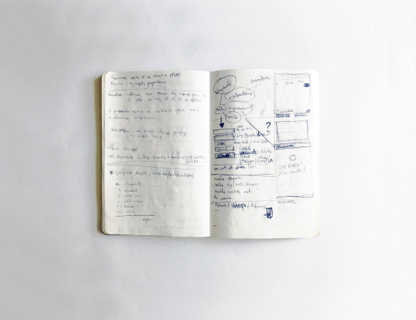
Research & Insights
My research combined field study observations of traders in live sessions, structured user interviews, usability testing under simulated trading conditions, competitive benchmarking (Bet Angel, Geeks Toy, financial trading terminal interfaces), and analysis of trading community forums.
The primary finding: professional traders during a live market were pattern-matching at speed, not using deliberate decision-making. The interface's job was not to support those decisions, it was to not interrupt them.
On perceived performance: users in testing couldn't accurately measure render delays below 100ms, but they consistently reported interfaces as "feeling slow" when visual updates were asynchronous with their interaction, even when the underlying data was current. I measured this through a specific protocol: timing the delay between a trader's click action and the interface's visual confirmation, then correlating perceived slowness ratings against measured delays. The threshold was consistent: updates that lagged behind interaction by 80ms+ were rated as "slow" regardless of data freshness. The fix was not faster data pipelines, it was synchronising animation timing to confirm interaction before data had resolved, then updating without visible interruption. A design fix, not an engineering one.
Colour carries established meaning. Deviating from red/green, lay/back conventions created measurable cognitive interference in experienced users. We extended the established vocabulary rather than replacing it.
Customisation has a higher adoption floor than expected. Even mid-level traders configured their layout within the first two sessions, then rarely changed it again. Configuration was a setup cost traders were willing to pay once.
The Solution & Key Design Decisions
Minimalist, content-centric interface philosophy. Every design decision was evaluated against a single question: does this element help the trader execute a better trade, faster? If not, it was removed. The resulting interface achieved its density not by showing everything, but by showing only what mattered, with maximum clarity.
Ladder view as the primary trading surface. I designed the ladder view interaction model from first principles. Working with both trader research and financial trading interface conventions to define column layout, price movement visualisation, volume depth display, and one-click bet placement. Multiple simultaneous ladder selections allowed traders to monitor several markets from a single view.
Redesigned cash-out flow. The cash-out UX was redesigned around a single principle: maximum speed with minimum doubt. The flow used a two-state confirmation model (a primary action that could be reversed within a brief window) that gave traders enough confidence to act quickly without the paralysis of a multi-step confirmation dialogue.
Material Design component system, adapted for trading context. Rather than building a bespoke design system from scratch, I implemented Material Design components as the structural foundation, then extended and adapted them specifically for the trading context, adjusting density, information hierarchy, and interaction states to match professional trader expectations.
Established colour semantics as a design constraint. We defined the colour palette starting from the functional requirements of trading communication (red/green for lay/back, colour-coded volume depth) and built the brand identity around these functional anchors rather than imposing a brand palette on top of them.
Configurable workspace architecture. Column order, market groupings, alert thresholds, and panel layouts were all configurable and persistent, allowing traders to invest once in configuration and work within their preferred environment for every subsequent session.
- Design governance across two clients. Codigree and KeepItSoft had different commercial priorities and different user mental models. I maintained design consistency through a written Design Principle Document, agreed by both clients at project inception, referenced in every major decision, and used as the escalation path for disagreements. When one client pushed to add a feature that would have increased cognitive load in the primary trading view (a persistent market watchlist panel), the principle document was the basis for the objection and the resolution: the feature was built, but as a collapsible overlay that defaulted to hidden, preserving the zero-noise principle in the primary view. The principle set was not a veto; it was a shared decision framework.
Impact & Results
Certified
Betfair Certified. The formal quality and technical standard for third-party trading platforms operating on the Betfair exchange
Preferred
Became the preferred trading platform for high-level traders, validated through community adoption and comparative user testing
↑ Speed
Measurably faster trade execution vs. Betfair native, particularly in cash-out scenarios. Users reported fewer missed windows
↑ Retention
High user retention driven by workspace customisation. Traders who configured their environment returned consistently and churned at lower rates
Lessons as a design leader
Designing for expert users requires unlearning most conventions about user-friendliness. Tooltips, onboarding tours, confirmation modals, all of these exist for novices. Expert users find them condescending at best, obstructive at worst. The hardest challenge was having the discipline to remove scaffolding rather than add it.
Established conventions in specialist domains are worth more than design elegance. Deviating from the red/green, lay/back colour convention would have been defensible on visual grounds. For traders who had built years of muscle memory around those colours, changing them wasn't a design improvement, it was a hazard. Knowing when convention should be respected rather than challenged is a form of design maturity.
Speed as a design value changes how you evaluate every decision. Perceived performance (the felt responsiveness of every interaction state) is a design responsibility, not an engineering one. The 80ms synchronisation fix was a design decision that had more impact on trader confidence than any visual change made on the project.
Design governance across multiple clients requires written principles, not verbal agreements. The Design Principle Document wasn't bureaucracy, it was the mechanism that kept the product coherent and the client relationships constructive when commercial priorities diverged. Writing it at the start is always worth it.