Timeline: 2021 – 2023
Platform: Web App + MS Word Add-in
Primary User: Lawyers, procurement managers, finance teams
Key Methods: User interviews, task analysis, prototyping, usability testing
Tools: Figma, Miro, Adobe CC, HTML/CSS, JS
Designing for AI-powered contract review trusted, transparent, and usable beyond the legal department.
Overview
Legartis is an AI-driven legal contract intelligence platform that automates clause extraction, risk detection, and compliance checking — reducing contract review from hours to minutes. When I joined as Lead Product Designer, the technology was capable. The product experience was not yet ready to make that capability credible.
Legal professionals were bypassing the AI not because it was inaccurate, but because the interface gave them no basis for trust. The design challenge was not building more features. It was designing an interface layer that made AI output transparent, auditable, and professionally defensible — for users whose personal liability depends on every contract they sign off.
My role spanned the full product scope: Microsoft Word add-in, web back-office platform, contract depositor flows, playbook builder, and the design system that held all of it together. I actively participated in roadmap definition and prioritisation alongside the PM and CPO, contributed to strategic product direction decisions, and led the design process from research through delivery across four major product versions.
Role
As Lead Product Designer, I owned the end-to-end design scope across the Legartis platform:
- Led product discovery, design strategy, and execution across all platform surfaces
- Built and maintained the full design system ecosystem from scratch
- Actively participated in roadmap discussions and feature prioritisation alongside the PM and CPO
- Led recurring design sprints and quarterly usability testing cycles with legal professionals
- Designed and validated interactive prototypes used by sales and customer support teams before development
- Collaborated cross-functionally with Product, Engineering, Customer Support, and Sales to align business priorities with user needs
- Advocated for key product decisions, including the Playbook Builder against competing priorities
- Delivered four major product versions between 2021 and 2023, each validated before engineering implementation
Working in legal tech required more than UX competence. It required understanding the professional context of users whose trust could not be earned through convenience alone — only through transparency, traceability, and control.
Context
Legal contract review is one of the most cognitively demanding professional tasks in any enterprise organisation. A single NDA can take 30–45 minutes to review manually. A complex data processing agreement requires several hours. At scale, hundreds of contracts per month across multiple reviewers, this creates unsustainable operational pressure on legal teams.
Legartis addressed this with AI capable of reviewing contracts with over 90% accuracy. The technology worked. The adoption problem was not a model problem, it was a trust problem.
The interface environment legal professionals faced was overwhelming by design. Traditional legal tools had evolved around documents, not workflows. They displayed information rather than guiding decisions. For a legal professional reviewing AI-generated findings, the absence of visible reasoning, sequential structure, and clear decision pathways created cognitive overload — and the rational response to cognitive overload in a high-stakes professional context is to revert to manual review.
The design opportunity was not to make the interface look better. It was to redesign the entire relationship between the user and the AI output; making the system legible, trustworthy, and professionally defensible.
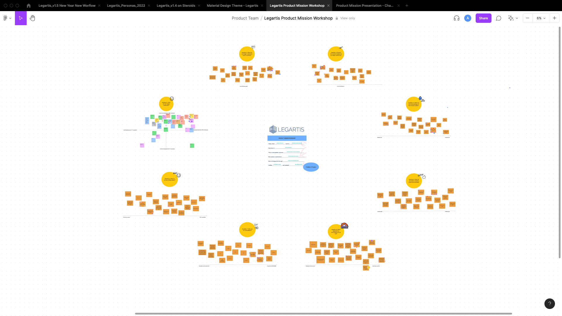
Berth Planing — Production Gantt. Live vessel allocations across 8 berth positions (th4–th8) over a 9-day rolling window. Colour coding: vessel type and carrier. Conflict indicators surface inline. — DCT terminal, May 2025.
Strategic Product Direction
Starting with the Microsoft Word Add-in
The decision to begin with the Microsoft Word add-in was strategic, not incidental. Legal professionals spend most of their working time inside Word. Building the primary review experience as an add-in — rather than a standalone web application — meant meeting users in their existing context rather than asking them to adopt a new one.
This decision also served a critical business need: the company required a client-facing product early to support sales cycles, customer onboarding, and enterprise procurement conversations. A standalone web platform would have taken longer to reach a usable state. The add-in gave commercial teams a demonstrable product within a compressed timeline.
Interactive prototypes of the add-in became sales and customer support assets before engineering had implemented a single component. The design process itself accelerated stakeholder alignment — customers could react to a realistic prototype, and those reactions shaped the product before any development investment was committed.
Roadmap Prioritisation
Early feature prioritisation was deliberate. Working alongside the PM and CPO, I actively shaped the roadmap to establish a scalable product foundation before expanding feature depth.
The strategic logic was straightforward: core workflow stability and usability had to come before secondary capabilities like search, sharing, or analytics. A product that reviewers could not trust for their primary task would not benefit from surrounding features, however well designed. The objective was a solid product skeleton — one that could support complexity as the user base scaled and requirements deepened.
This meant advocating against requests to add features that assumed a level of user confidence the product had not yet earned. Every prioritisation decision was anchored to a single question: does this strengthen the core workflow, or does it extend a foundation that is not yet stable?
Problem
Why Legal Professionals Were Bypassing the AI
The AI was accurate. Users were not using it. Understanding why required going beyond survey feedback and into the actual review context.
Three structural problems were consistent across every research session:
Opacity without rationale. AI findings were presented as conclusions; a clause was flagged, a risk was identified without any explanation of why. For a legal professional whose professional reputation is attached to every contract they approve, acting on a conclusion they cannot interrogate is not professional practice. It is liability transfer. The response was rational: ignore the AI and review manually.
No sequential structure. Legal review is a workflow with a defined order, positional awareness, and explicit completion states. The interface presented findings as a flat list alongside the document — comprehensive but cognitively disconnected from how review actually happens. Users had to maintain their own mental model of progress, creating overhead that cancelled out the time saving.
No collaboration infrastructure. Contracts move between reviewers. Associates escalate to partners. Legal hands off to procurement. The platform had been designed for a solo reviewer who does not exist in enterprise legal teams. Every team-based user described workarounds involving email, version tracking, and manual coordination that the product had no mechanism to replace.
"I don't need it to be faster if I then have to verify everything it does. That's not saving me time. That's moving the work somewhere else."
— Legal counsel, enterprise customer · discovery interview
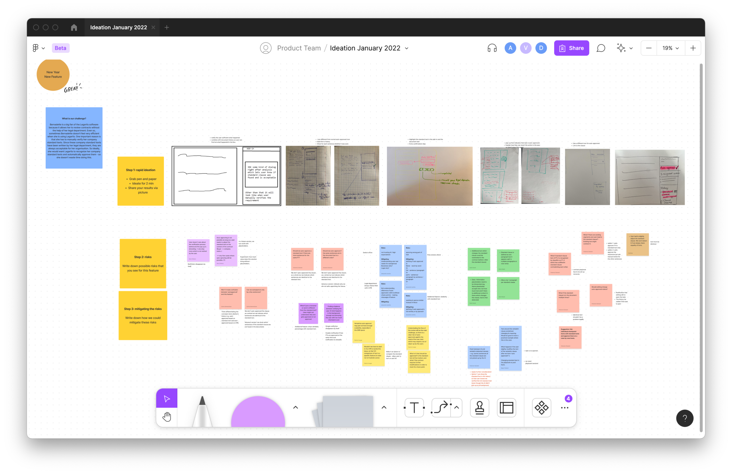
Berth Planing — Production Gantt. Live vessel allocations across 8 berth positions (th4–th8) over a 9-day rolling window. Colour coding: vessel type and carrier. Conflict indicators surface inline. — DCT terminal, May 2025.
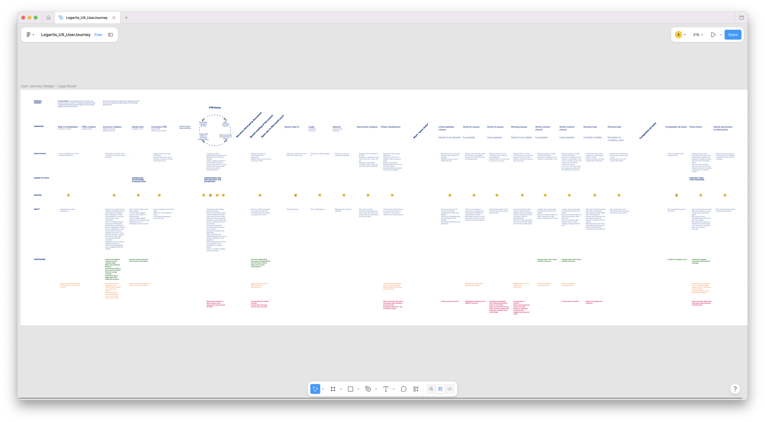
Berth Planing — Production Gantt. Live vessel allocations across 8 berth positions (th4–th8) over a 9-day rolling window. Colour coding: vessel type and carrier. Conflict indicators surface inline. — DCT terminal, May 2025.
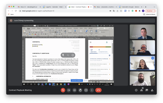
Contract Playbook design session (April 2022). Cross-functional review with Legartis legal team and enterprise customer. Interface visible: Contract Checker, 17 open tasks / 6 completed. Advocating for Playbook Builder as primary onboarding path required pushing against engineering complexity — and the 30-day retention data validated the call.
Research & Validation
Understanding the Domain Before Designing for It
Designing for legal professionals required genuine domain literacy, not just UX process. I spent significant time learning the structure of NDAs and DPAs, the regulatory environment legal teams operated within, and the professional accountability framework that shaped every decision they made.
Research methods included:
- Contextual interviews with legal reviewers, procurement leads, and finance controllers across enterprise and mid-market accounts
- Task analysis and cognitive walkthrough sessions observing live contract review workflows
- Two structured usability testing rounds (Phase I against the v1.3 prototype, Phase II against v1.4) with 8 participants per round drawn from active legal professionals
- A/B testing across 12 copy variants for AI-generated finding labels
- Competitive benchmarking against Kira Systems, Luminance, and Ironclad
- Customer journey mapping across four contract workflow archetypes
The most significant single finding (confirmed across every research session) was the distinction between accuracy and legibility. Legal professionals did not need the AI to be perfect. They needed to understand its reasoning well enough to make a professionally defensible decision about whether to accept or challenge it.
Everything that followed was downstream of that finding.
What the Research Revealed
Information hierarchy matters more than feature completeness. Users who received a clear, sequenced review experience consistently outperformed users with access to more features but without structured navigation. The interface's ability to communicate what to do next was more valuable than additional capability.
UX copy carries trust signal. A/B testing across 12 AI-generated label variants produced one of the most concrete findings of the project. "Needs to be verified" outperformed both "Potential risk" and "AI flagged" on trust and action rate — not because it was friendlier, but because it was active rather than descriptive. It told the reviewer what to do, not just what the system found. Active, instructional language outperformed passive, descriptive language at every test point.
Collaboration is a day-one enterprise requirement. Every team-based user described a contract handoff workflow. Building for the individual reviewer — and treating collaboration as a later-phase feature — would have required expensive structural rework. Designing the review state, annotation system, and escalation model for shared use from the beginning was both the right product decision and the right architectural one.
Accessible information hierarchy reduces cognitive overload. Legal interfaces are already dense environments. Applying WCAG-aligned contrast ratios, clear typographic hierarchy, and progressive disclosure patterns was not a compliance exercise — it was a cognitive load management strategy. Users could scan, orient, and act more quickly when the interface respected basic accessibility principles. WCAG compliance and usability quality were the same objective.
The Design System
Built to Support Complexity, Not Just Enforce Consistency
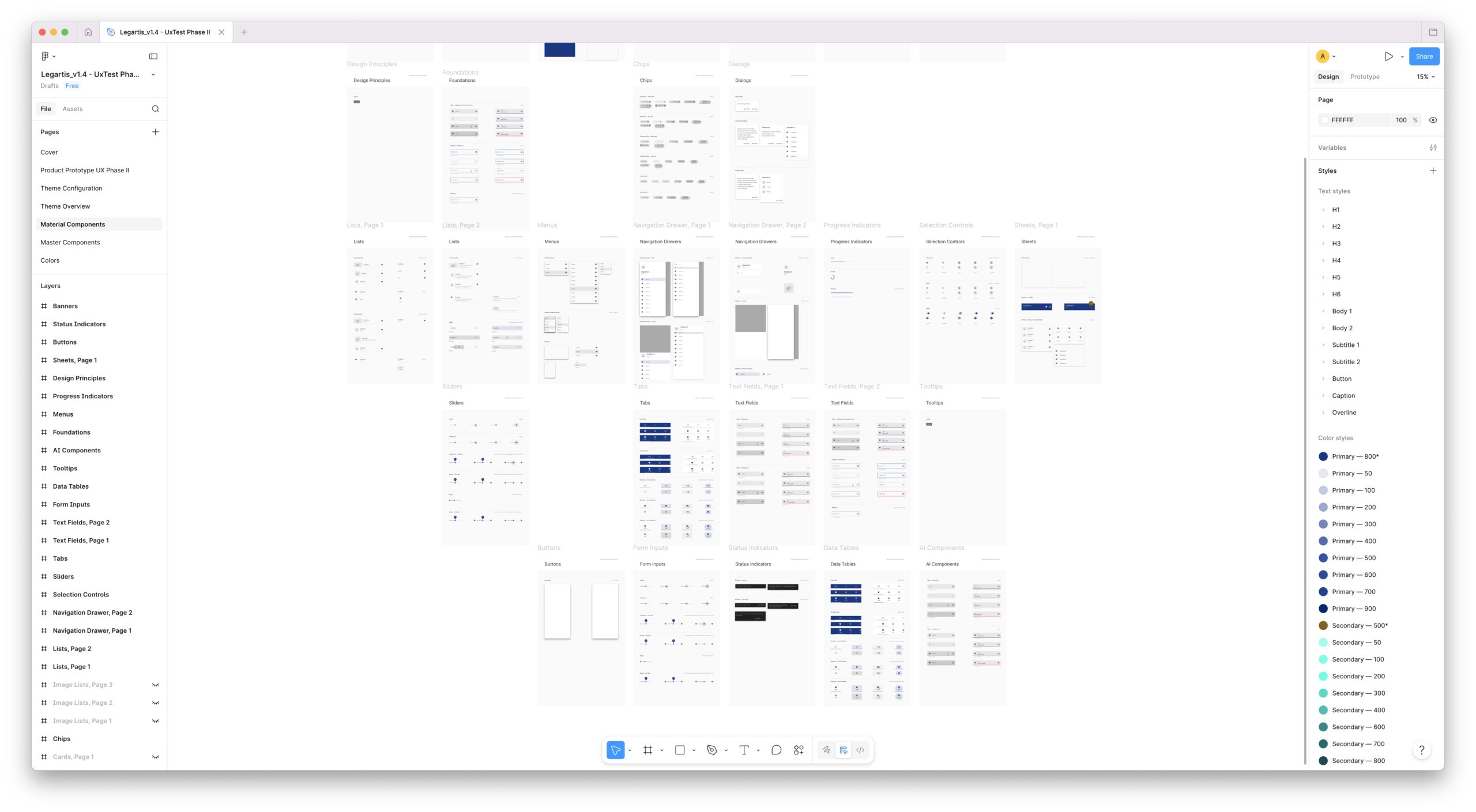
I created and developed the entire Legartis design system — the component library, interaction patterns, token architecture, and documentation that governed every surface of the product.
The system was not built to produce visual consistency for its own sake. It was built to support a specific operational goal: ensuring that the add-in, web back-office platform, contract depositor flows, and internal playbooks felt like parts of the same product experience — not tools from different teams built at different times.
Design system scope:
- Token architecture: colour, typography, spacing, elevation, state, and semantic legal-status tokens
- Component library covering add-in surfaces, web platform layouts, form interactions, and data displays
- Interaction patterns for AI-generated findings: presentation, rationale display, action models
- Accessibility standards: WCAG 2.1 AA compliance built into component specifications, not retrofitted
- Documentation for engineering implementation, maintained as a living reference rather than a point-in-time export
Berth Planing — Production Gantt. Live vessel allocations across 8 berth positions (th4–th8) over a 9-day rolling window. Colour coding: vessel type and carrier. Conflict indicators surface inline. — DCT terminal, May 2025.
Accessibility as Architecture
Cognitive overload is a design failure mode, not a user trait. Legal interfaces tend to be dense by default — documents are long, findings are numerous, and the stakes of missing something are high. The design system was built to counteract this by enforcing information hierarchy at the component level.
WCAG-aligned contrast ratios ensured that status indicators were readable under the variable lighting conditions of real office environments. Typography scale decisions gave reviewers a clear visual hierarchy between clause categories, finding types, and action prompts. Progressive disclosure patterns in the add-in — surfacing summary state first, with detail available on interaction — reduced the visual density of a full contract review to a manageable per-step experience.
Accessibility was not a checklist. It was a structural decision about how much information to show at once, and in what order.
Cross-Surface Cohesion
The design system's most important function was making the transition between product surfaces invisible to the user. A legal professional who reviewed a contract in Word and then opened the back-office platform to check its pipeline status should not need to re-orient. The interaction model, the status vocabulary, the navigation structure, and the action patterns should feel like the same product — because they were governed by the same system.
This cohesion also improved development collaboration. Engineering teams implementing the add-in and teams implementing the back-office platform could reference the same component specifications, the same token values, and the same interaction documentation. The design system reduced implementation divergence by eliminating the ambiguity that causes it.
Key Design Decisions
Decision 1: Structured Sequential Review
The most important structural decision in the redesign was replacing the flat findings list with a step-by-step sequential review flow.
Legal review has a defined order. Reviewers move through a contract section by section, clause by clause, in a sequence they understand and can audit. An interface that ignores this sequence — presenting all findings simultaneously with no sense of position, progress, or remaining work — forces reviewers to maintain their own mental model of review state. That cognitive overhead is exactly what the AI was supposed to eliminate.
The redesigned review flow structured the experience as a sequence of discrete steps, each corresponding to a contract section or clause category. Reviewers always knew: where they were in the review, how many steps remained, what they had already decided, and what still needed action. The system tracked this state — making reviews resumable, transferable between reviewers, and auditable after completion.
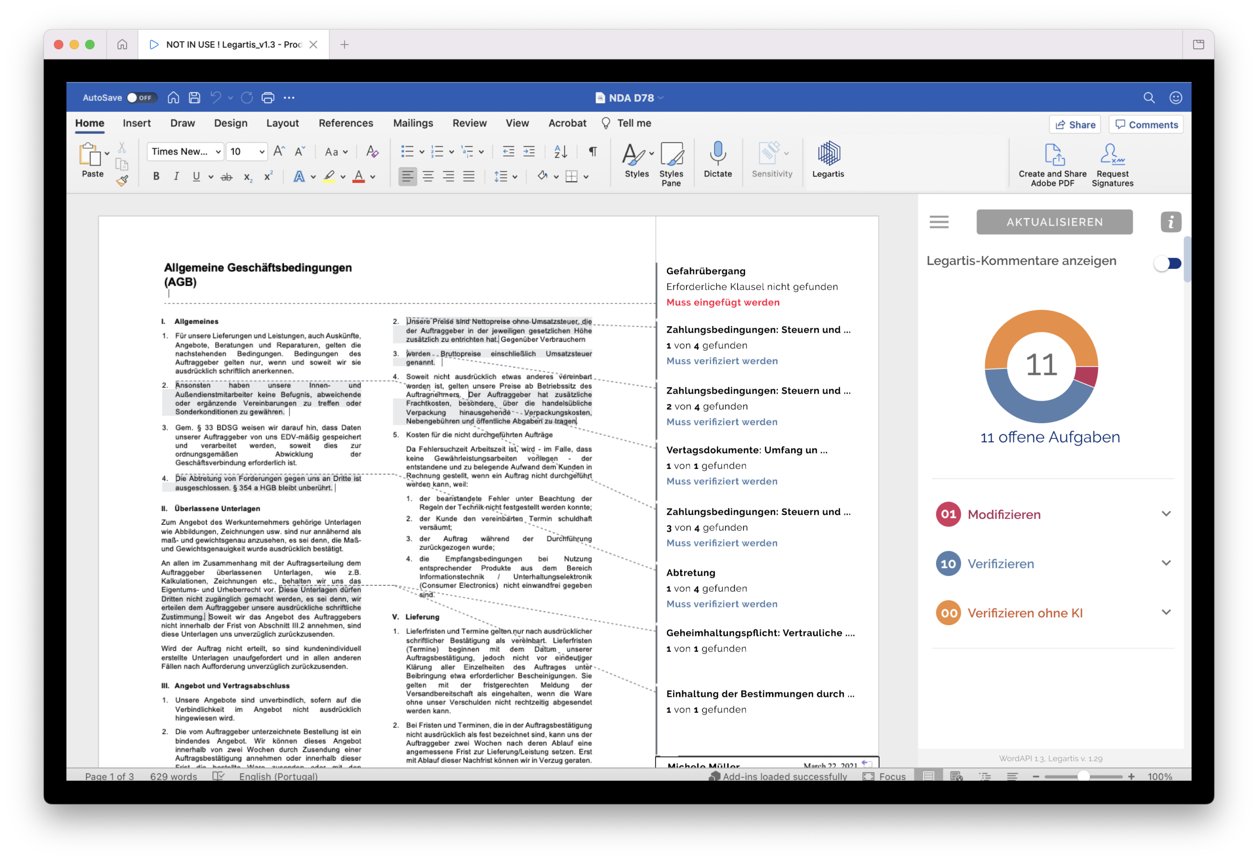
Before: Flat findings list. Reviewer manages their own progress mentally. No completion state. No handoff mechanism.
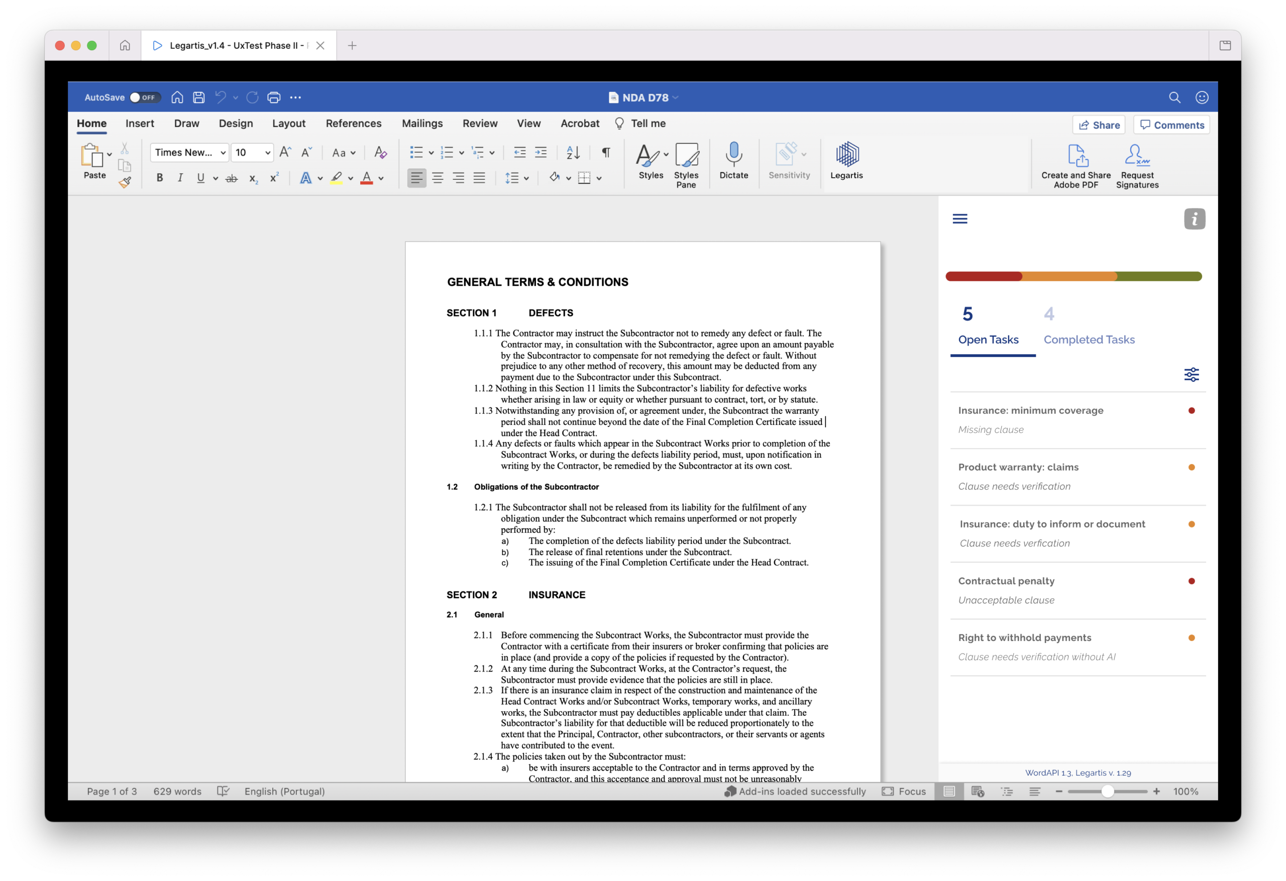
After: Sequenced review steps with explicit progress tracking. System-managed state. Resumable and auditable. Designed for team workflows from the beginning.
Decision 2: AI Rationale as the Primary Trust Signal
The single most impactful change to the add-in was restructuring every AI finding to lead with its rationale rather than its conclusion.
Instead of: "Clause flagged — potential risk."
The redesigned finding showed: what clause was checked, which company requirement it was tested against, where in the document the AI found the relevant text, whether the requirement was met, partially met, or absent, and what the recommended action was.
This is the difference between a system reporting a result and a system explaining a judgment. For legal professionals, the former is a data point to be sceptical of. The latter is a basis for a professionally defensible decision.
Usability testing confirmed this directly. Phase I users, shown only conclusion states, re-read the underlying contract clause in 73% of cases before acting. Phase II users, shown the full rationale stack, re-read the clause in 26% of cases. The interface change did not alter the AI's output. It changed how much cognitive work users had to do to trust it.
Decision 3: The Three-Action Decision Model
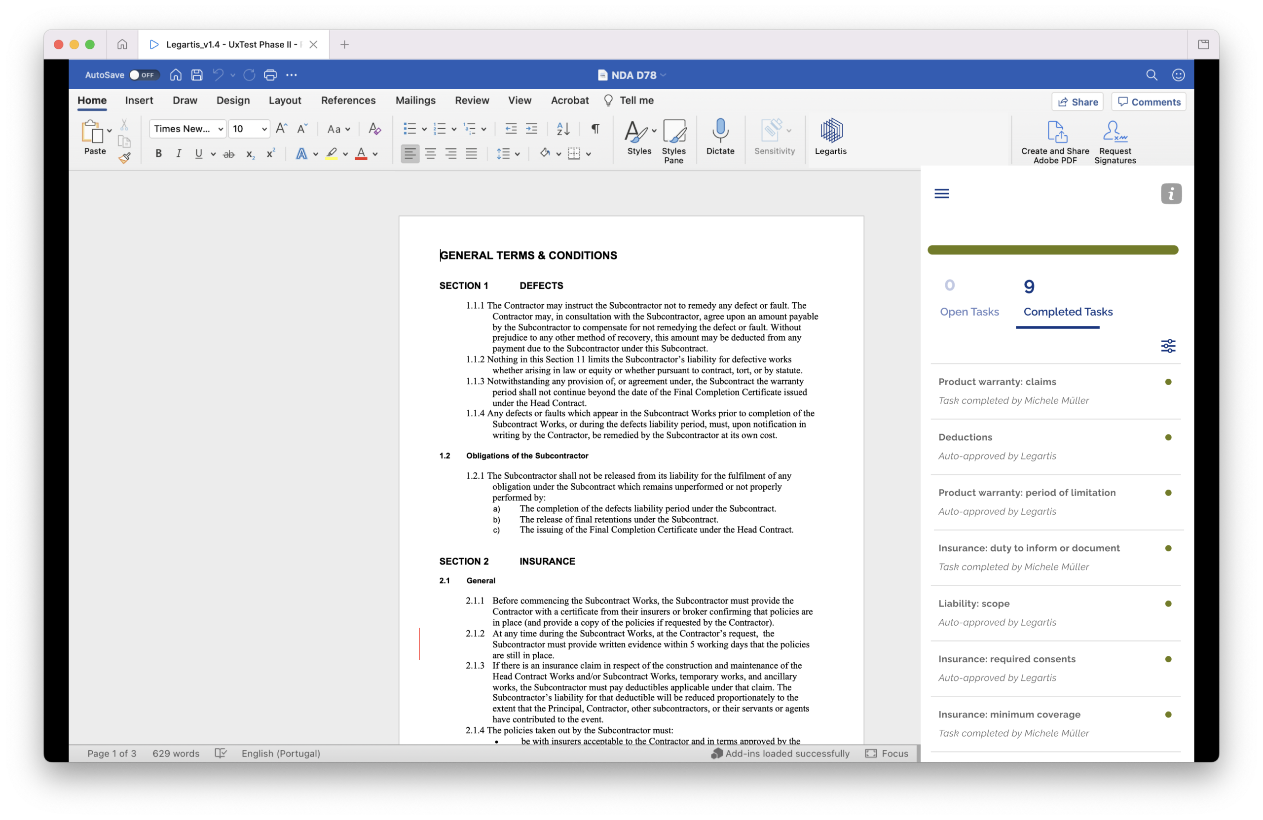
Every AI finding in the redesigned interface offered exactly three explicit actions: Accept (the AI assessment is correct and the clause meets the requirement), Annotate (the reviewer disagrees or wants to qualify the finding with a note), or Escalate (the finding requires senior review before a decision can be made).
This model resolved three separate problems simultaneously.
It created an audit trail. Every decision was attributable, timestamped, and reversible — meeting the audit requirements that enterprise legal teams cited as a non-negotiable for adoption.
It made review handoffs possible. A review with Accept/Annotate/Escalate decisions recorded can be handed from an associate to a partner without requiring a briefing. The decision record is the briefing.
It eliminated the ambiguous middle state — reading a finding and closing the panel without acting — that had made it impossible to know, at the end of a review, whether every finding had been considered.
Usability test Phase I: 41% of participants used an explicit decision model for every finding without prompting. Usability test Phase II: 89% of participants used Accept/Annotate/Escalate for every finding without prompting.
The design change produced a 48-percentage-point improvement in explicit decision adoption between rounds.
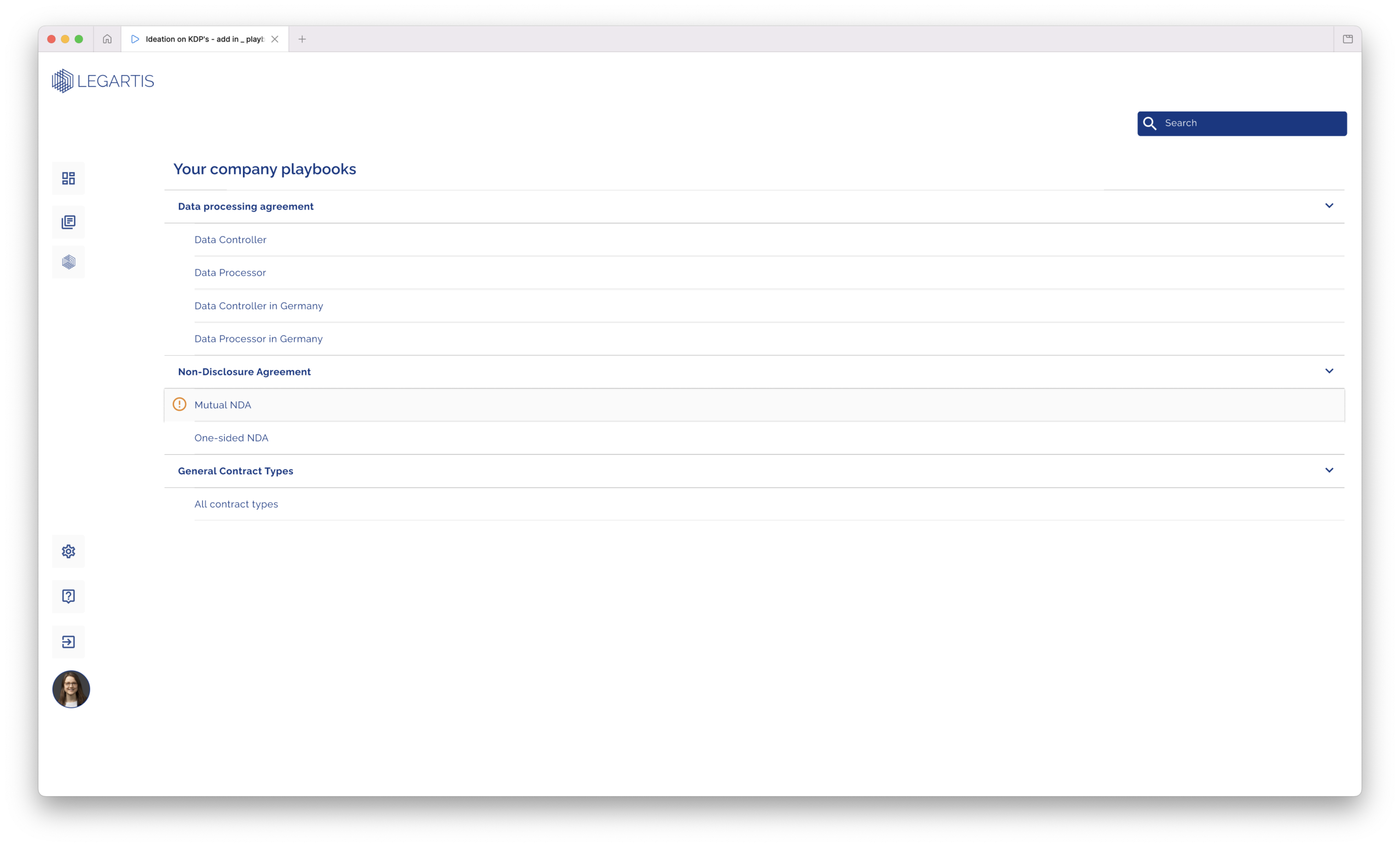
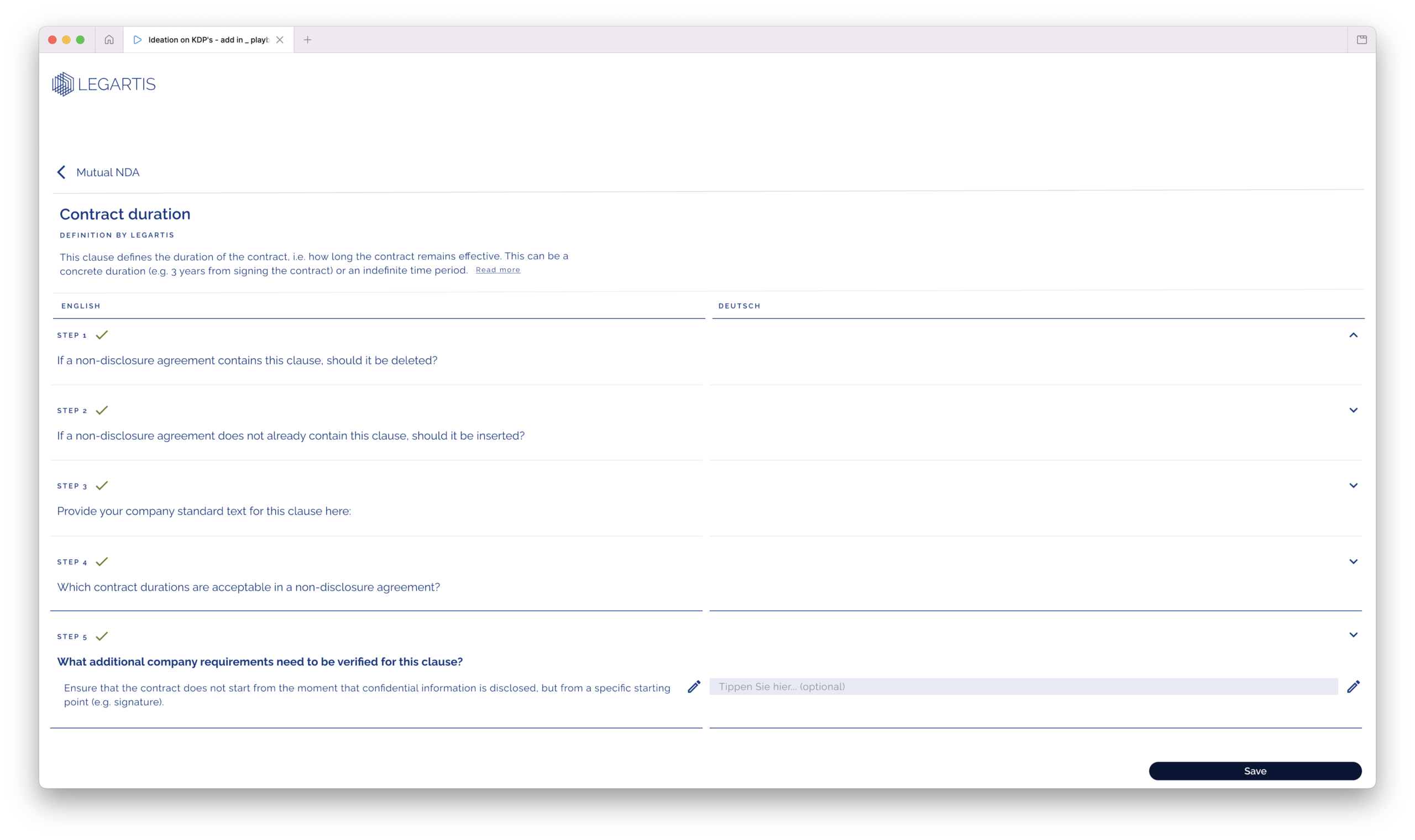
Decision 4: Playbook Builder as Primary Onboarding
Advocating for the Playbook Builder as the primary onboarding experience required sustained effort against legitimate competing priorities.
Engineering complexity was significant. The Playbook Builder was one of the most technically demanding components in the product. It would have been easier — and faster — to treat it as a power-user feature available after initial setup rather than as the entry point to the product.
The research case was clear. Users who built a company playbook in their first session had substantially higher 30-day retention. The mechanism was straightforward: users who encoded their own rules became co-authors of the system. Their ownership of the playbook content produced ownership of the review outcomes. They were not consumers of AI decisions — they were authors of the standards the AI was applying.
Treating Playbook Builder as a secondary feature would have optimised for time-to-first-use at the cost of long-term adoption. The prioritisation argument was anchored in retention data, not design preference, and it was made directly to the CPO with that framing.
The Playbook Builder shipped as the primary onboarding path.
Decision 5: The Web Platform Pipeline Architecture
The back-office web platform presented a distinct design challenge from the add-in: how to make the AI review pipeline legible to users who were not the primary reviewer — procurement managers, compliance officers, and senior legal counsel who needed oversight without doing the review themselves.
The solution was representing the AI pipeline as four explicit, auditable stages: Pre-check → Generator → Comparison → Analysis. Each stage displayed its current status, its result, and its available action. The pipeline was not hidden — it was the primary interface object.
This transparency served multiple goals. Users who understood what the AI was doing at each stage were more confident in its outputs. Managers who needed to report on contract review status had a clear, stage-level audit trail. Legal teams subject to regulatory oversight could demonstrate a documented review process for every contract in the system.
The process log below each contract completed the picture: every review action, every override, every escalation — named, timestamped, and exportable.
The Design Arc: Four Versions, Continuous Validation
Delivering a complete platform redesign across four major product versions between 2021 and 2023 required a disciplined iterative process. Every version was informed by structured usability testing and validated before engineering implementation.
v1.2 (baseline): Flat findings list, no sequential structure, no explicit decision model, individual-only workflow.
v1.3: Introduced the step-by-step review sequence, the three-action decision model, and the "Missing" clause state — surfacing the company's standard clause text with an insertion instruction when a required clause was absent. Validated in Phase I usability testing.
v1.4: Introduced the full AI rationale stack, the structured company requirement display, and the collaborative annotation model. Validated in Phase II usability testing. Produced the 48-percentage-point improvement in explicit decision adoption.
v1.5: Production-ready implementation of the complete review flow with full engineering fidelity to design intent. The three-action model shipped without modification from the design specification — indicating high-quality design-to-engineering translation.
Each version was preceded by a research and testing cycle. No version entered engineering implementation without usability validation. This discipline added development time in the short term and eliminated expensive late-stage redesign in every case.
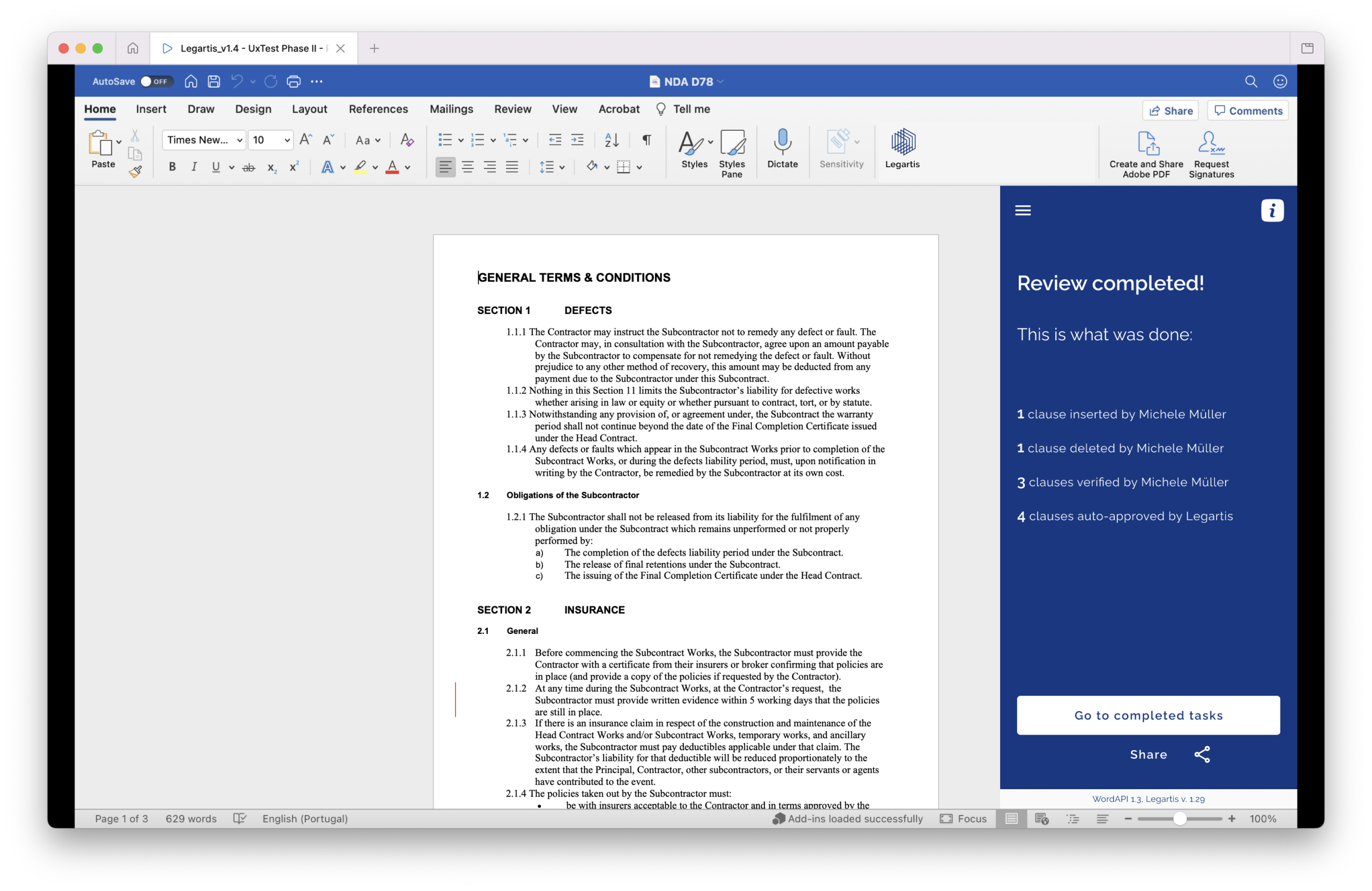
UX Test Phase II (2022) — full contract view. The test document used across Phase II sessions: a General Terms & Conditions contract with AI annotations surfaced inline across all five sections. Findings shown include: clause extractions with "Task completed by the software" (green), findings requiring human verification (orange "Needs to be verified"), and flagged deletions ("Needs to be deleted"). The density of the annotation layer across this contract was deliberately chosen to stress-test the interface's legibility under real-world volume conditions.
Outcomes
The platform transformed complex legal review processes into clearer, more structured experiences that improved usability, onboarding efficiency, and user confidence across enterprise legal teams. Legal professionals who had been bypassing the AI began using it — not because the AI changed, but because the interface gave them the transparency and control they needed to trust it.
+34%
Task completion improvement
Full review task completion rate v1.3 → v1.4. Target was 70%+; v1.4 reached 81%. Primary driver: structured step sequence replaced free-form navigation.
−47%
Clause re-verification rate
Reduction in manual re-reads of AI-flagged clauses between prototype rounds. Reviewers who understood the rationale didn't re-read the source clause to verify the finding.
3.2×
Faster NDA review
End-to-end NDA review time in guided prototype vs. baseline. Measured across 8 test participants.
89%
Action model adoption
Percentage of test participants who used the Accept/Annotate/Escalate model for every finding without prompting in Phase II, up from 41% in Phase I.
85%
faster contract review
Enterprise customer deployments — publicly documented
< 10m
per DPA
Down from 45–60 minutes · Arvato Supply Chain Solutions deployment
Platform scope
Beyond the contract review flow.
The redesigned review flow was the strategic core of the work, but the platform scope extended across the full contract lifecycle. Each area below was designed to the same standard of transparency, auditability, and role-appropriate information density.
Contract repository + search
AI insights dashboard
Contract playbook system
Document header / status
CMSWord Add-in (5 versions, 2020–2023)
Error states + edge case library
NDA checker dashboard
Admin annotation system
Software update flow
Multi-language
UX copy (EN/DE)
Persona framework · 8 roles
User journey maps · 4 archetypes
Impact & Results
The Legartis redesign ran across two years and three major version milestones (v1.3 → v1.4 → v1.5). The primary measure of success was adoption: whether legal professionals used the AI review path rather than bypassing it.
v1.5
Four-version design arc
Complete platform redesign delivered across four major versions from 2021 to 2023, each driven by structured usability testing and validated before engineering implementation.
8
Personas designed and validated
Legal counsel, procurement lead, finance controller, CLO, external reviewer, IT admin, power user, onboarding user — each with distinct workflows and success metrics.
100%
Action model fidelity
Accept/Annotate/Escalate model implemented without modification in engineering — a high-fidelity translation from design intent to shipped product.
v1.5
Four-version design arc
Complete platform redesign delivered across four major versions from 2021 to 2023, each driven by structured usability testing and validated before engineering implementation.
Cross-Functional Collaboration
Legartis operated with a small, distributed team. Design influence on product direction required continuous cross-functional engagement and not occasional input.
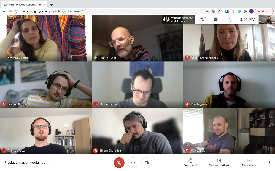
I worked closely with the PM on sprint planning, feature scoping, and release sequencing. With Engineering, I maintained design QA reviews at every release, comparing delivered builds against specifications at the component and interaction level rather than just visual fidelity. With Customer Support and Sales, I aligned on the prototype workflow ensuring that the interactive prototypes I produced for stakeholder validation were also usable as sales demonstration assets and customer onboarding materials.
This dual-use of design prototypes, as both UX validation instruments and commercial assets, accelerated the product's market entry and reduced the gap between what sales teams were promising and what the engineering team was building.
Lessons as a design leader
AI trust is an interface design problem. Accuracy is necessary but not sufficient. Transparency, rationale, and control are what make AI output professionally usable.
Sequential processes need sequential interfaces. Legal review has a defined order. The interface that followed that order outperformed the one that didn't — in every measurable dimension.
UX copy is a design material. "Needs to be verified" versus "Potential risk" is not a copywriting preference. It is an interaction decision with a measurable effect on trust and action rate.
Roadmap prioritisation is a design responsibility. Advocating for the right product foundation — core workflow stability before feature expansion — required making a product strategy argument, not just a UX one. That argument belongs to design.
Accessibility and usability are the same objective. WCAG-aligned information hierarchy did not improve accessibility at the cost of usability. It improved both simultaneously, because cognitive overload is a failure mode that affects every user under pressure.
Design systems create operational cohesion. The consistency between the add-in, the back-office platform, and the depositor flows was not accidental. It was the result of a design system built to govern all of them from a shared foundation.